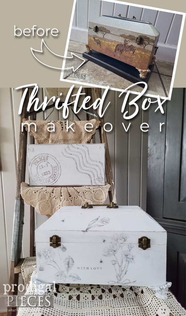
Maybe I’m a little quirky because when I “shop”, I’m not looking for the pretty but rather the downtrodden, the misfit, the broken, and let’s face it… ugly. This thrifted box makeover falls into that final category, in my opinion.
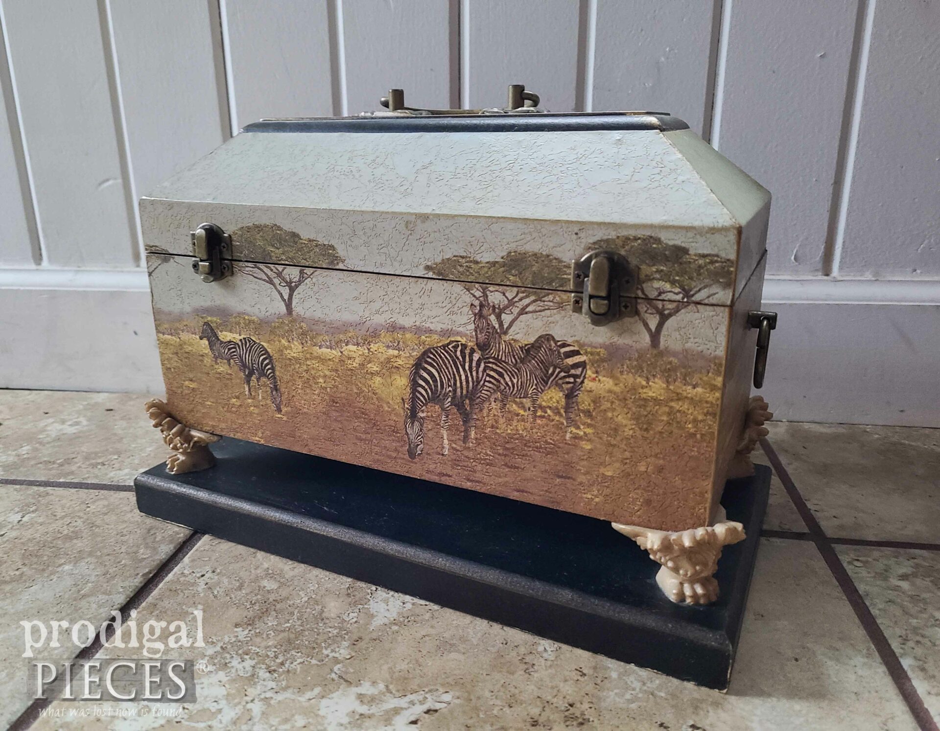
Here’s how it went down: I walk into the thrift store to shop for my kids, but also wanted to look at the household wares section. While there, I look at the wood section, the metals, and very rarely the glass. Initially, I pick up a metal hook with an enamel tile with a bathtub and French words on it. However, while holding it, I gaze past it and see this… er… gem.
I literally put the hook down and gleefully smiled while saying to myself, “It’s so ugly. It’s perfect!’
The best part is when I went to the cashier and set it on the counter. She turned it to see it better and said, “oh… that’s interesting.” bwahahaha! you know you got an ugly one when a lady who looks at junk all.day.long. calls it as she sees it.
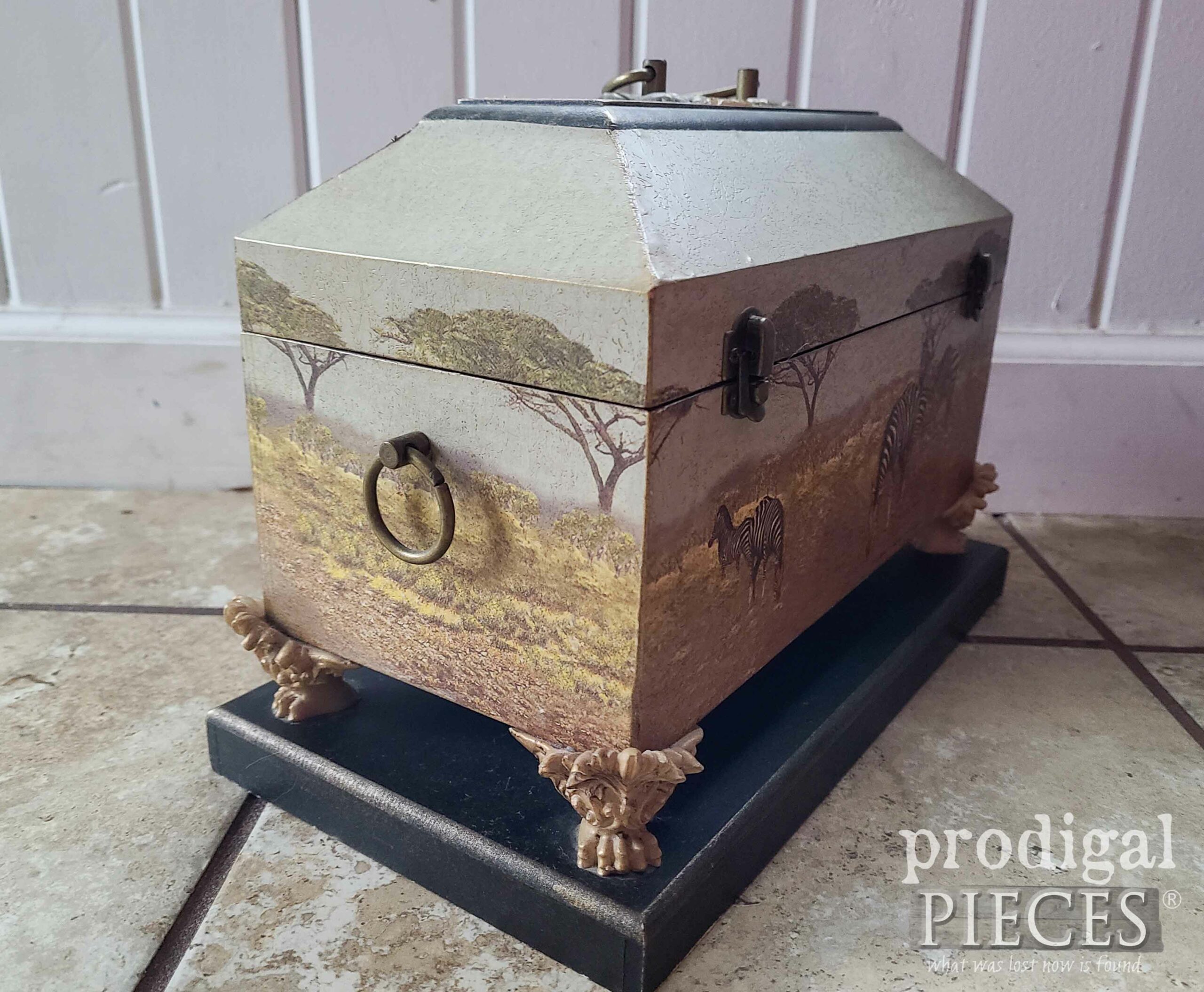
I mean, yes it has a sort of charm about it, but it definitely screams box store, don’t you agree?
LET US BEGIN
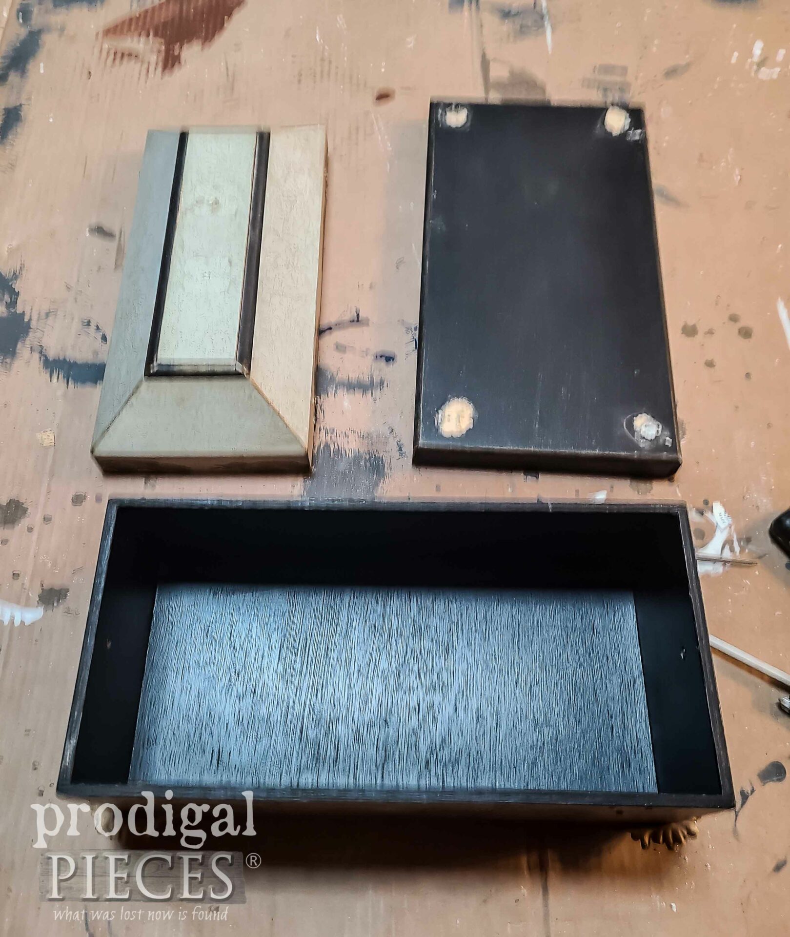
As you can imagine, I’m ready to have playful fun with this. First, I take all the hardware off and remove the base as it’s not going back on. I apologize for the fuzzy pic, but I blame Loula for that one… ahem.
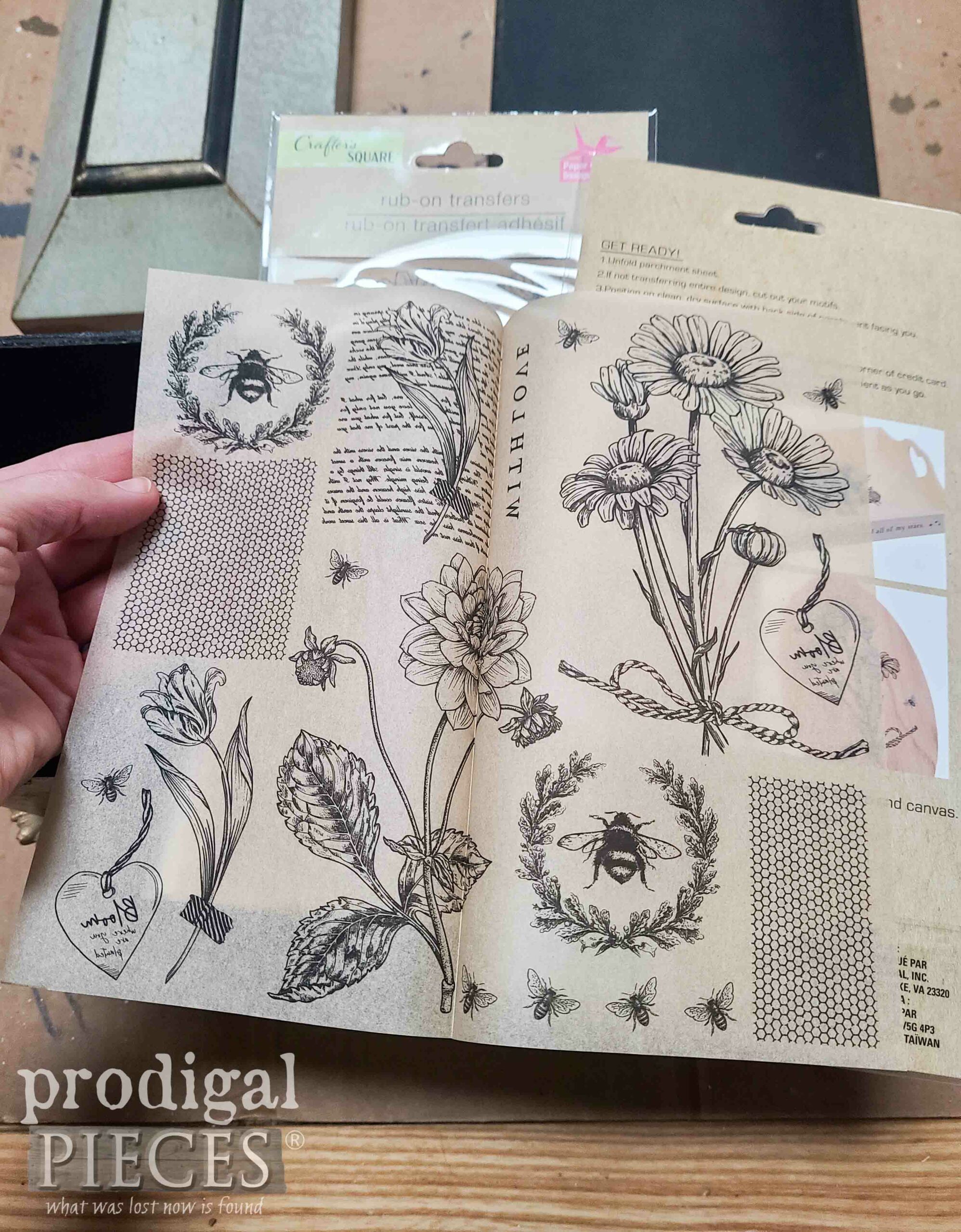
Then, I pull out these transfers I picked up from the dollar store that will suit the look I’m after. Aren’t they pretty?
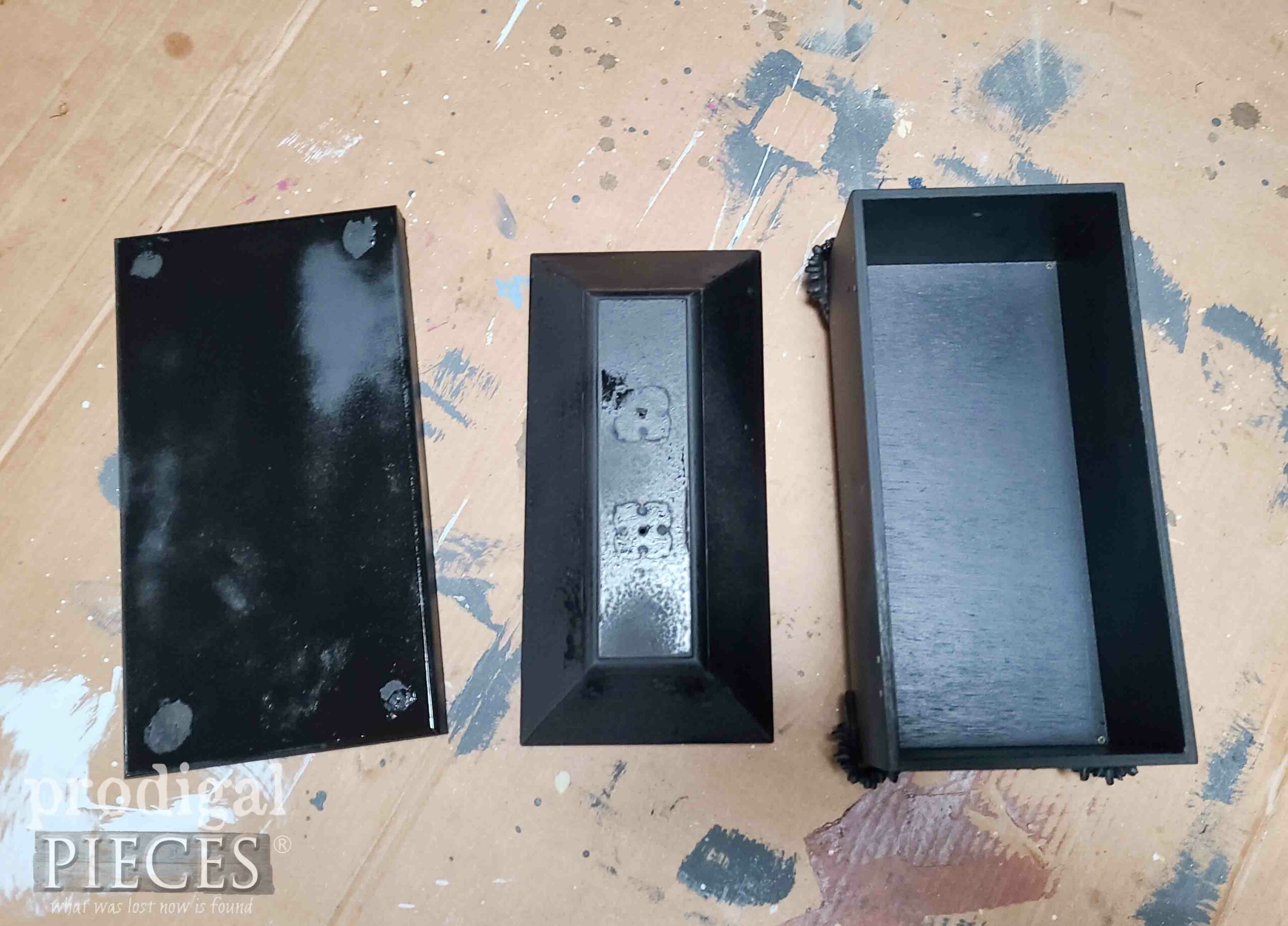
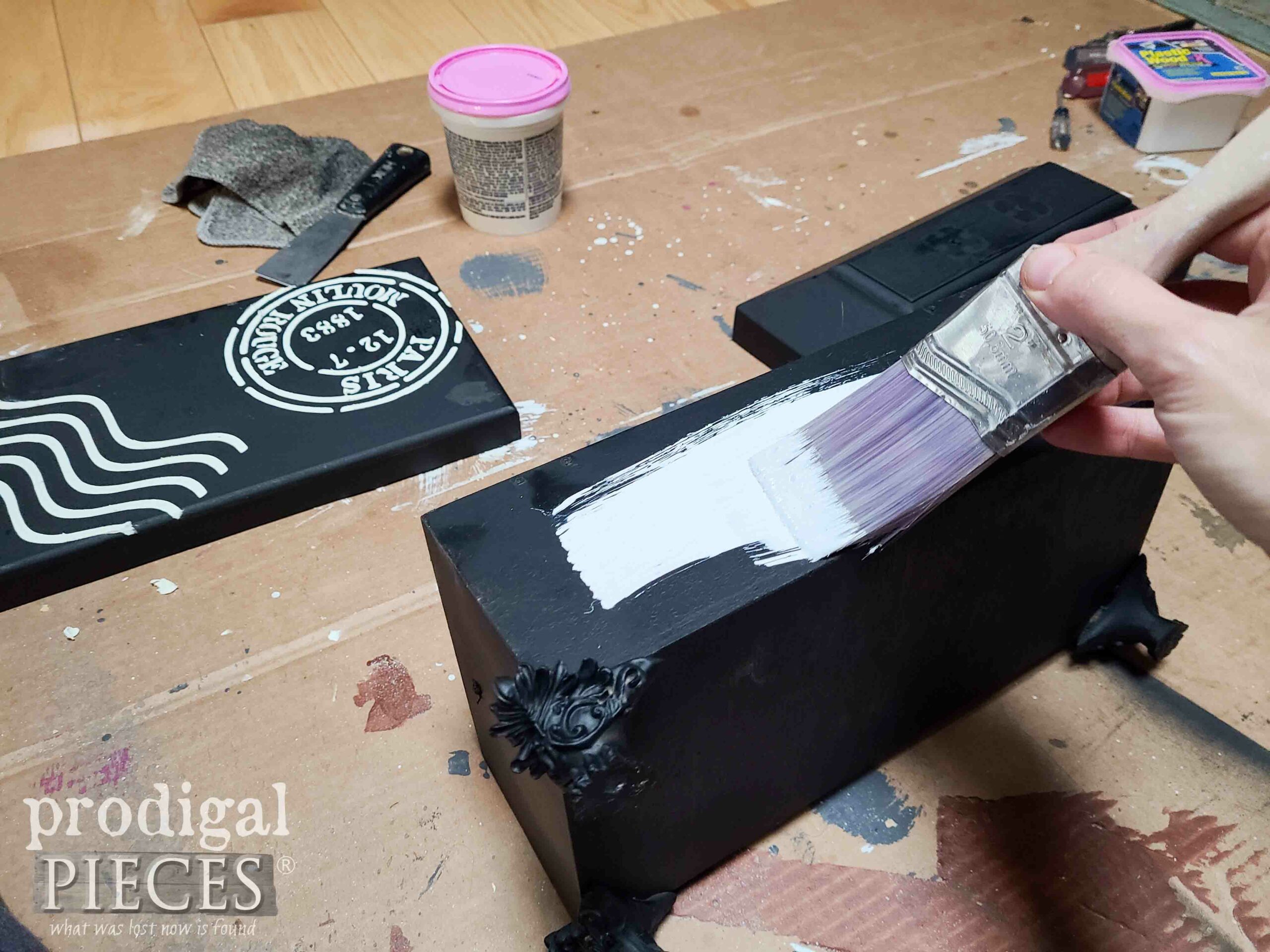
Next, in order to make those shine, I need a blank slate. I paint all the pieces a flat black and let cure.
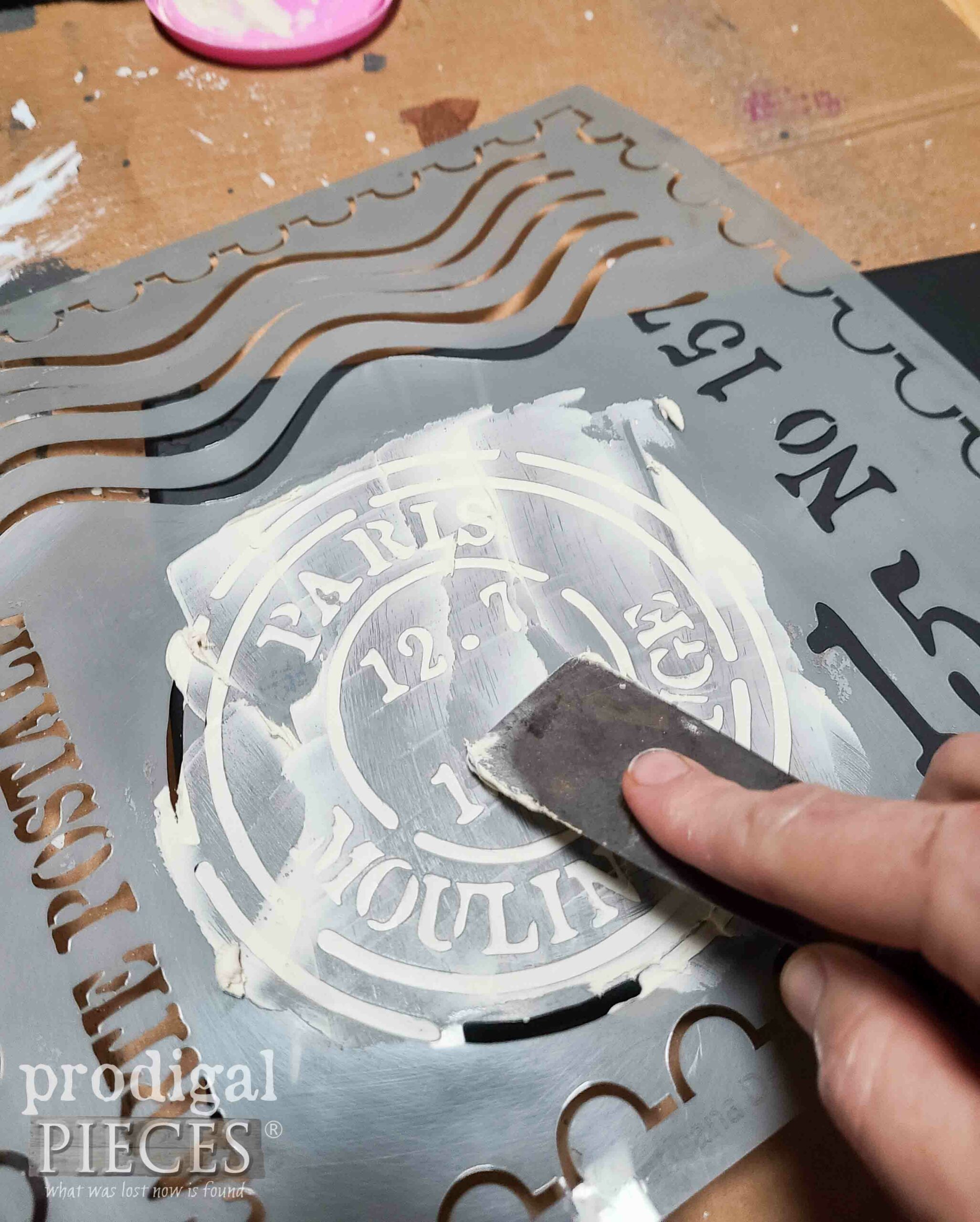
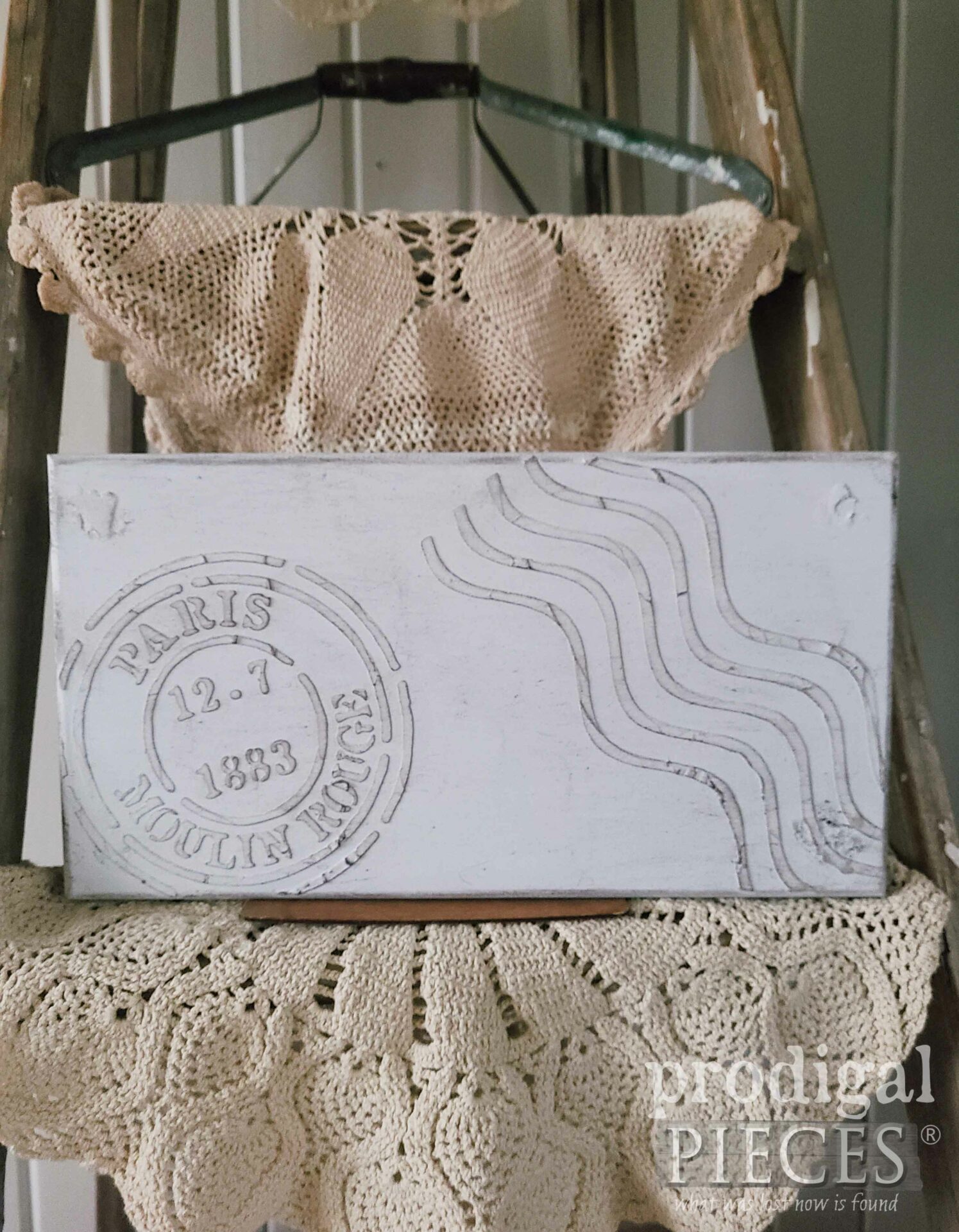
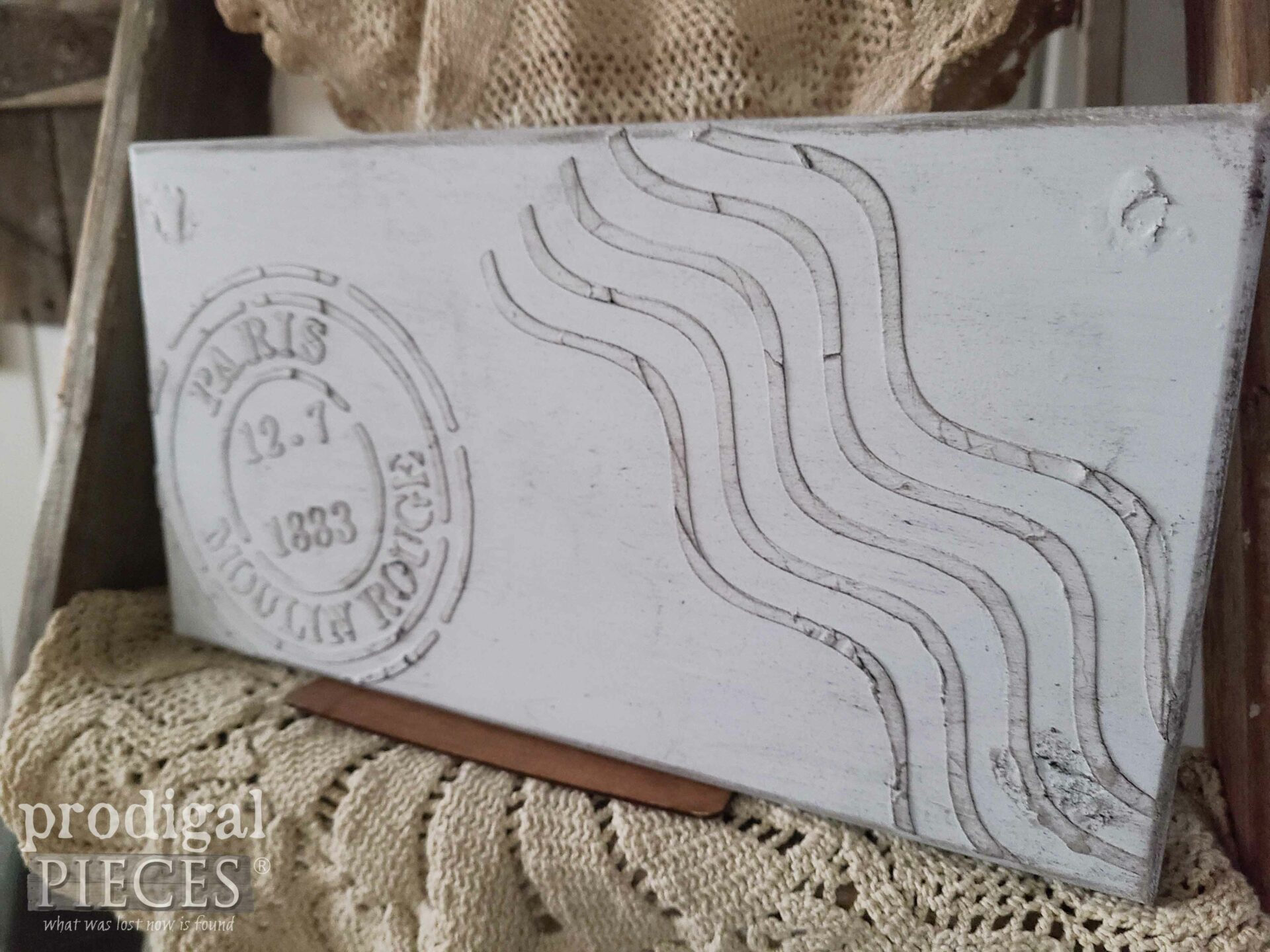
After that, I use my spackling and a stencil to create an embossed effect on the base. You can see my previous use of this technique I started using nearly ten years ago on this jewelry armoire. Not only is it effective but has endless uses.
Then, while the spackling is curing, I take my white milk paint and brush on two coats to the box base and lid.
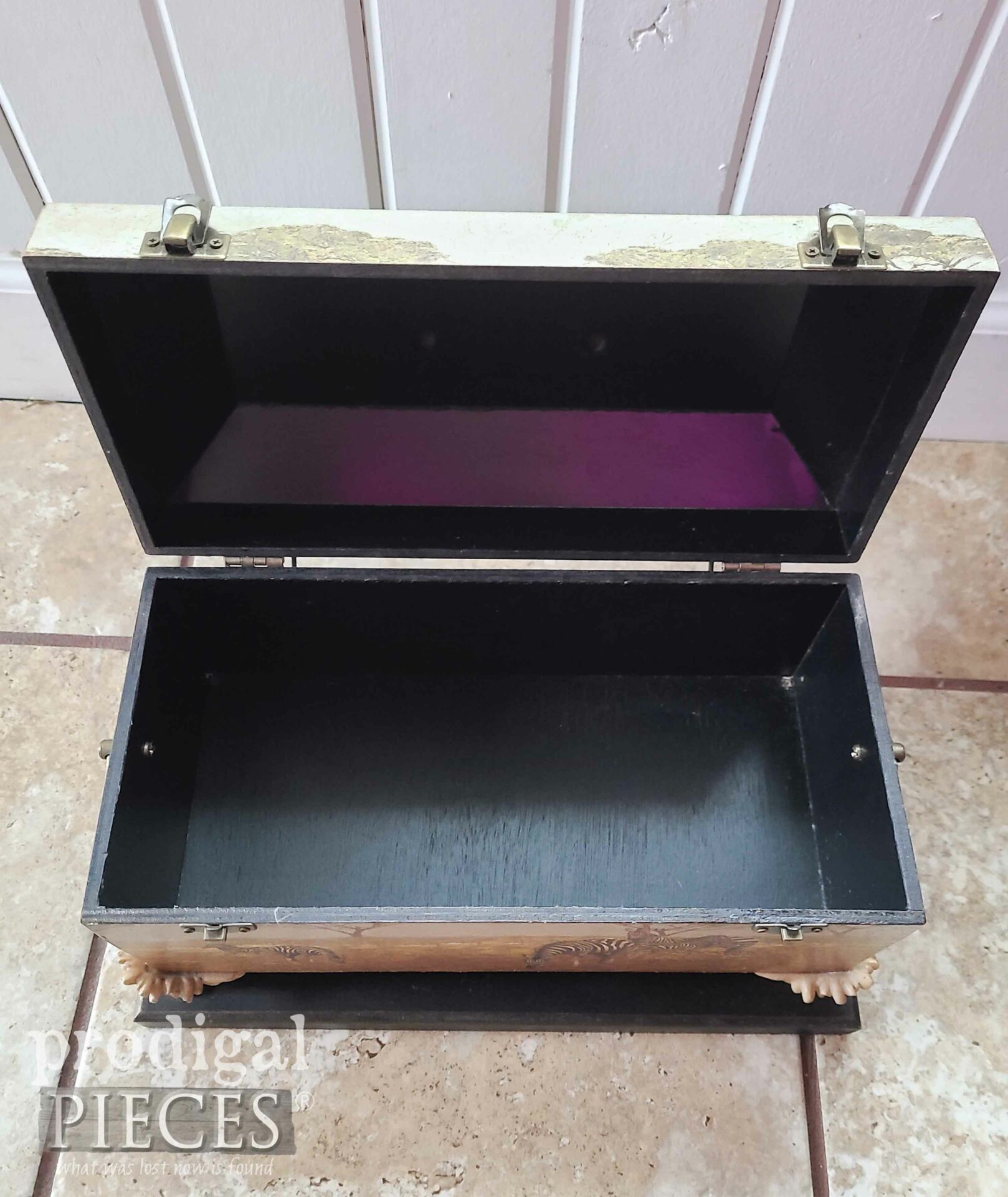
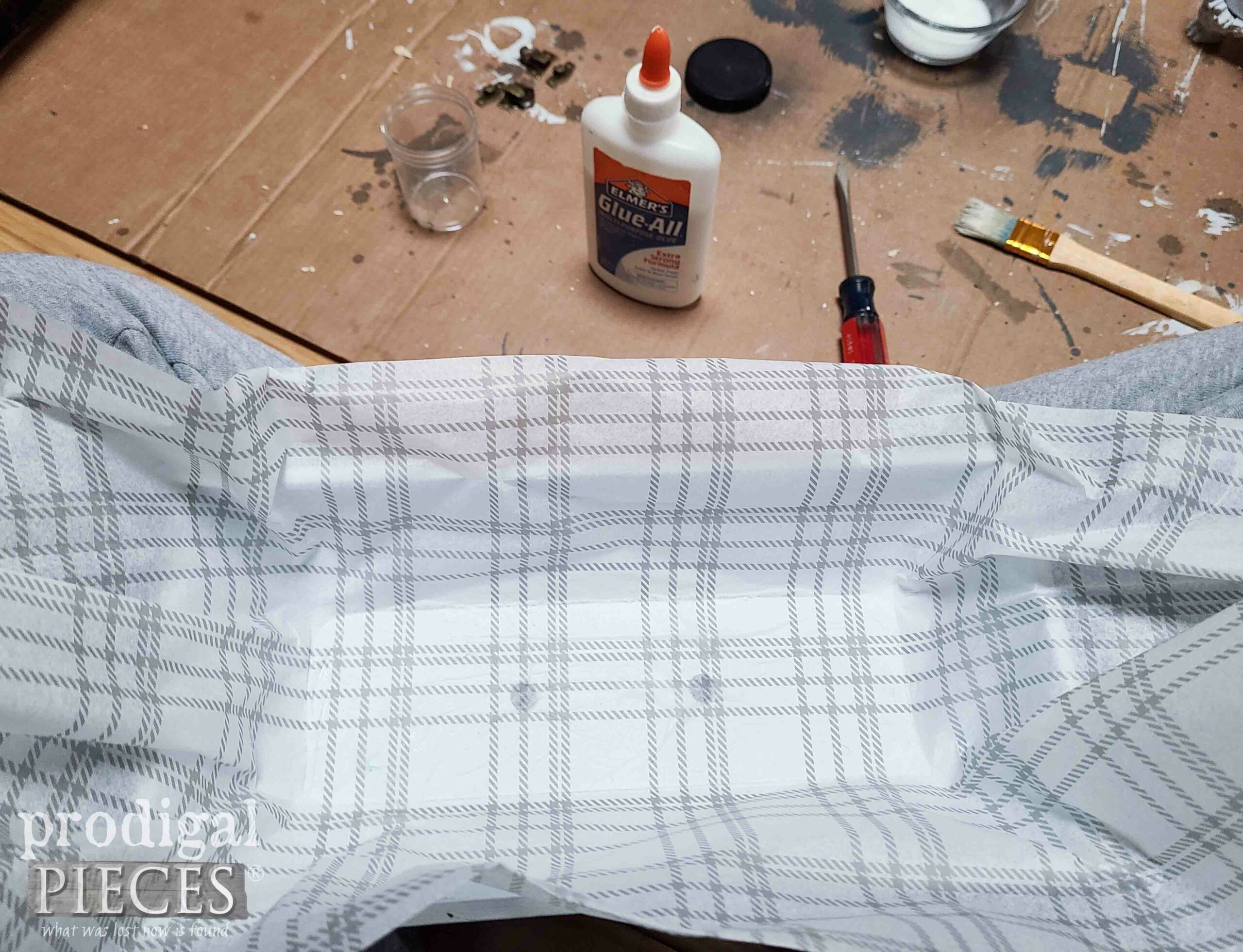
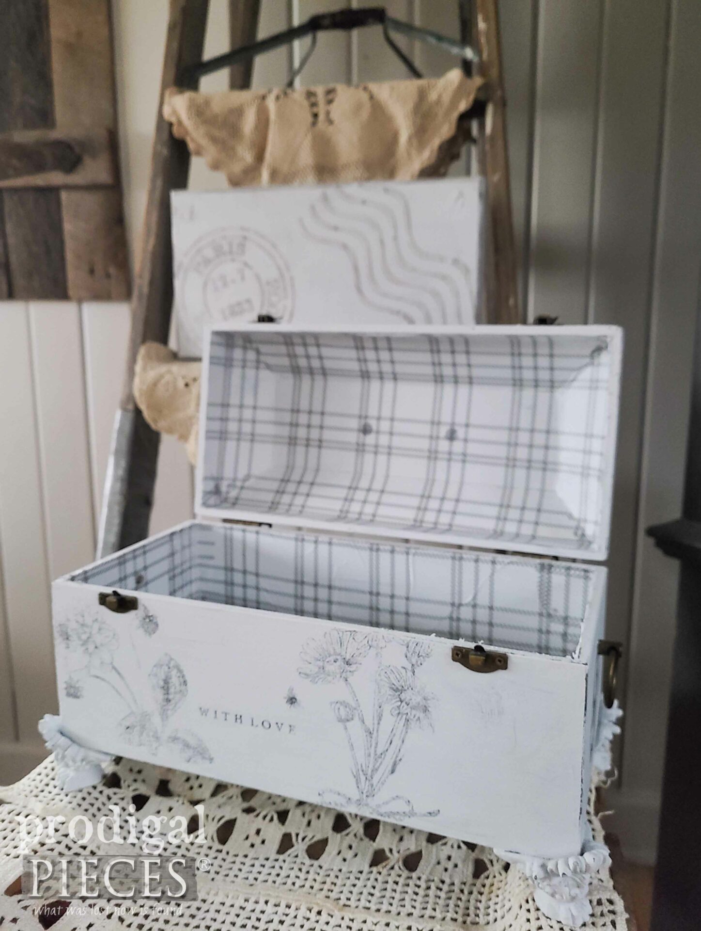
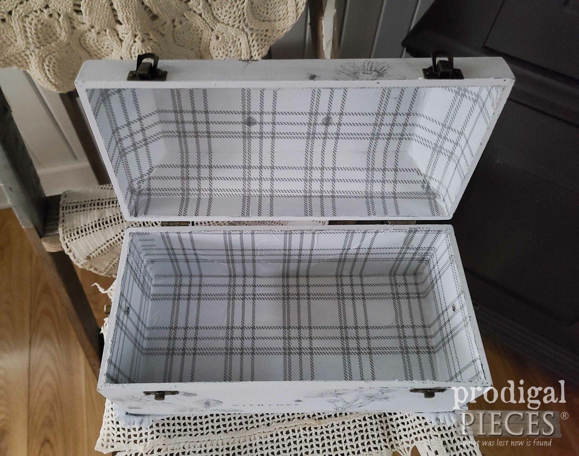
Last, once the paint cures, I use this fun tissue paper to line the interior in decoupage style. You can see all my decoupage creation in these past posts.
NEW LOOK
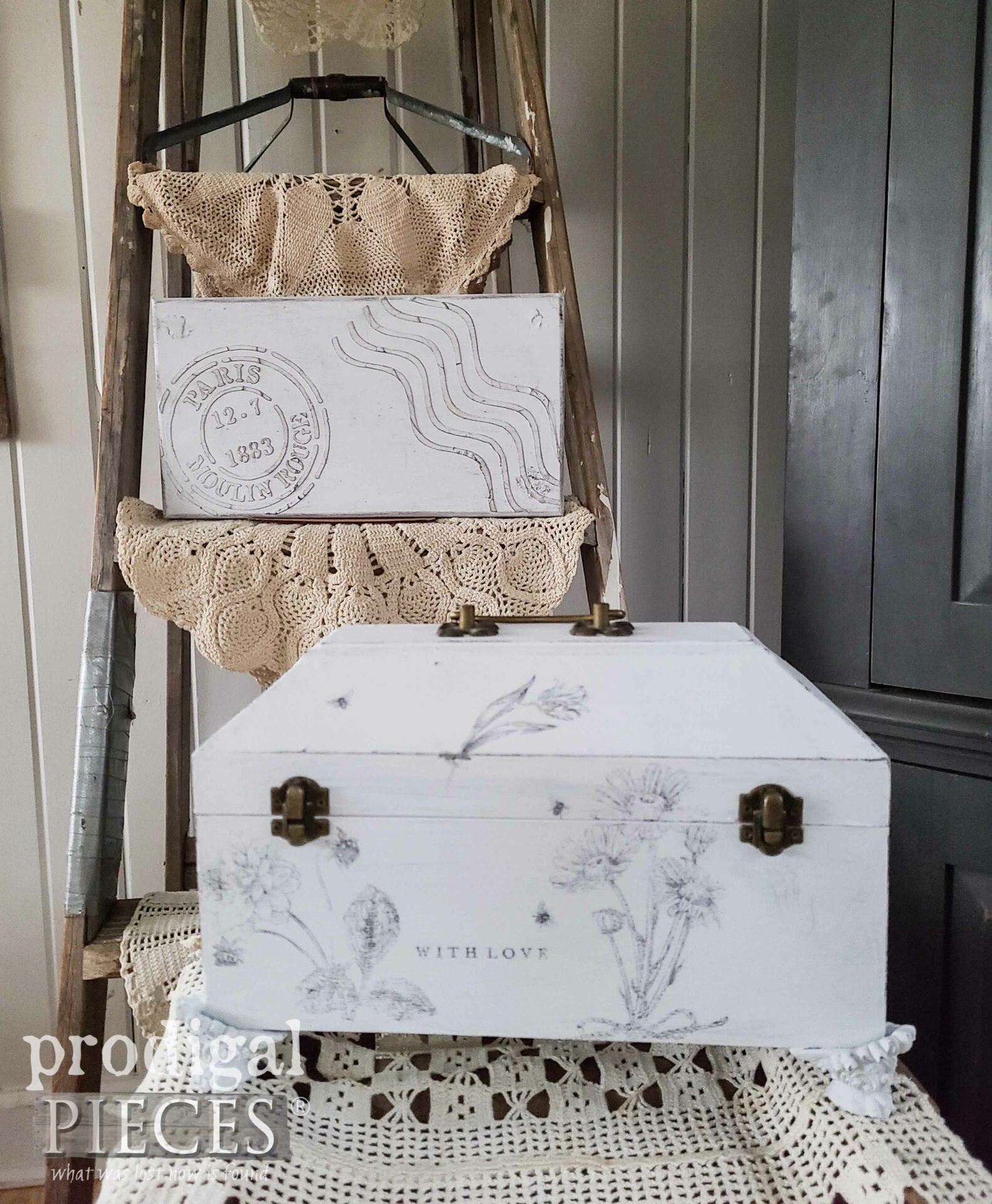
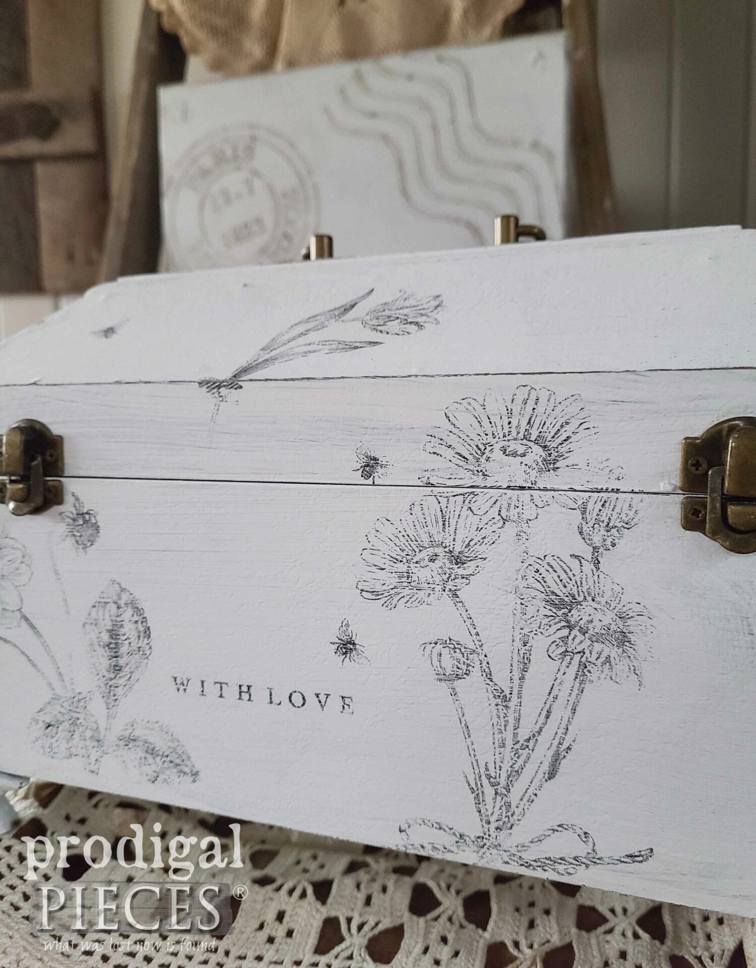
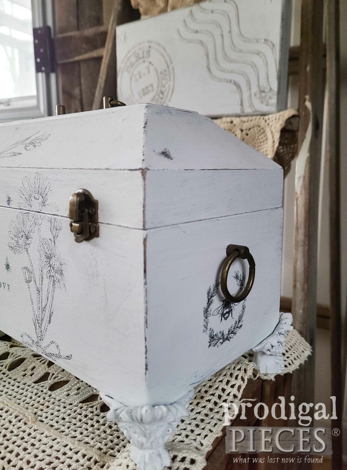
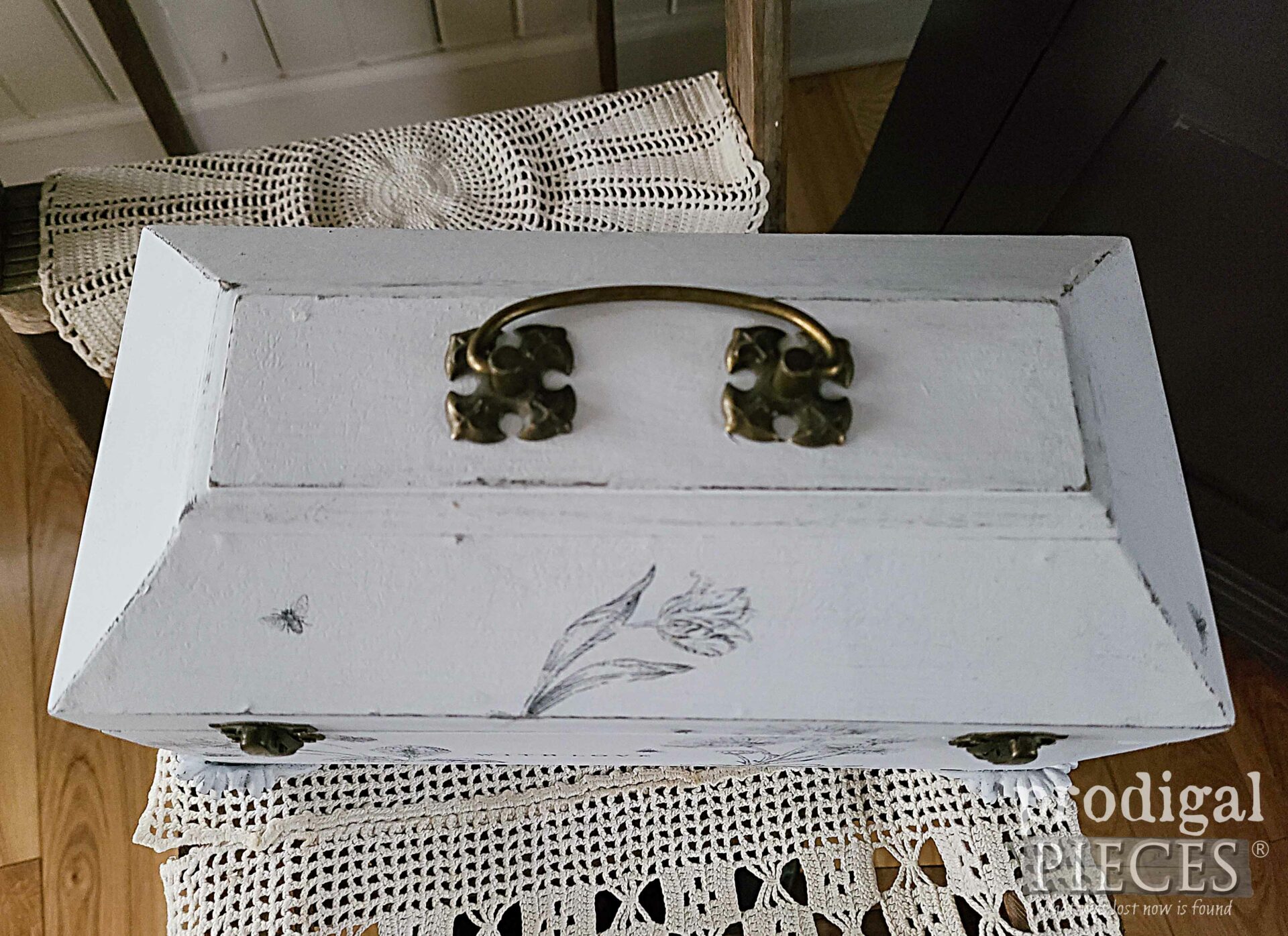
Finally, here are my two new projects from my one thrifted box makeover.
The transfers make the box have whimsy, and I enjoy the original hardware, so I let that be.
However, I’m not sure if my favorite part is the exterior or the interior.
Next, here’s the base of the original box with a brand-new look.
Which one is your favorite? If you’d like to add them to your home story, you can find them and more in my online store.
SHARE
As always, I look forward to hearing your comments. Tell me what you would do with this box? Maybe leave it as-is? After leaving some comment love below, do pin and share to inspire others to be on a quirky hunt while at the thrift store.
Before you go, be sure to sign up for my FREE newsletter to see what I come up with next. See you then!

Good morning. I’m always so elated when one of you four that I follow make a silk purse from a sow’s ear.
These two pieces are incredible. The box is so lovely in it’s simplicity. ane the base is a win, win.
You are so very creative, and I always enjoy your items.
Thanks for sharing with those of us who can only copy and embellish what you talented one create.
You are a ray of sunshine to me, Sue. Thank you for bringing a smile to my face and for your kind words. I wholeheartedly enjoy sharing.
Uuumm that box is sure something……Black on white is always a good bet and the paper inside is my favorite! It calms down all the edges even though it should make them more pronounced. I’m not sure I understand why there are such ornate legs on it , but the way you went with this makes them not such a stand out eyesore. It’s always nice to get extra projects from one.
This week was a long freezing cold one here, but otherwise pretty good. I pray that your next week is more restful. I would ask how you manage to keep your head up…But God! Your faith is evident in that even in the midst of trying times you are praising and offering thanksgiving. Blessings!
It really was. haha! Yeah, not sure what was the original goal, but I least I tamed those zebras. 😉 Thanks, Nikki.
And yes… Only God.
Are you ever tempted to go back to the store to show them how you turned the “interesting” into something beautiful?
Sometimes when I see stuff that people have thrown to the curb, I want to fix it up and then sneak it back to their porch!
Oh yes! This particular store actually printed several of my projects in short with links to my site on flyers and had them displayed throughout the store. It was fun to see relevant projects related to sections of their store.
You should do that! I’ve shown my neighbors their “junk” (aka. #trashure) before. Their look is priceless.
Well, it looks like a cremation URN!
It did! Not any more.
Well it isn’t ugly anymore. Great makeover.
whew! Thank you, Cheryl. 😉
The original was just creepy — even though the painted scene wasn’t bad, it didn’t “fit the canvas”!! It is always delightful to see you work your “magic” (translate that to “hard work”) transform something unappealing to something so attractive!! Beautiful work, as always, Larissa.
right? That paper-wrapped scene was one thing, but just the whole thing together had a death feeling. haha. Thanks so much for the smile, Marti.